Branding for Sustainable Businesses: How to Look as Good as Your Values
Sustainability has become one of the strongest narratives in modern business. Customers care about it, investors care about it, and some founders also genuinely care about it. But as sustainability moved into the mainstream, a strange visual uniformity appeared. Many sustainable brands began to look exactly the same.
Muted greens. Soft serif fonts and maybe a leaf symbol somewhere in the logo and packaging printed on recycled kraft paper. We all know the look. Natural tones and organic materials can absolutely work. The issue is that sustainability slowly turned into a visual shortcut rather than a reflection of what a company actually does. When every sustainable brand (or brand that want to be perceived as sustainable) looks identical, it’s hard to tell what you’re actually selling.
Consumers are also increasingly sensitive to the gap between message and reality. It’s difficult to ignore when a brand presents itself with earthy packaging and gentle typography while the actual product lifecycle tells a different story. Recycled packaging and nature-inspired design do not automatically make a company sustainable. When the visual identity communicates environmental responsibility that the business itself does not fully support, customers quickly recognize the disconnect.
That tension is where sustainable branding becomes interesting from a design perspective. The challenge is not simply to look “green,” but to create a brand that communicates responsibility, trust, and quality without relying on visual clichés. The most convincing sustainable brands achieve this not by mimicking a common aesthetic, but by allowing their real decisions to shape the visual language.
In many cases, the strongest signals of sustainability are not decorative at all. They come from materials, production choices, supply chains, and transparency about how things are made. When those elements exist, the design can support the story instead of trying to replace it.
Before thinking about colors or logos, it helps to consider what actually makes sustainable branding feel credible. A few principles appear again and again when brands successfully communicate environmental values.
What makes sustainable branding feel authentic
Materials tell the story. Packaging, paper choices, inks, and production methods are part of the brand narrative, not just the container around the product. You can have a loud, colorful brand identity without any leafs – if you use sustainable materials it will automatically look like a more nature forward brand. The logo itself doesn’t have to transport that look for you.
Transparency builds trust. Brands that openly show how products are sourced and produced create far stronger credibility than those relying on vague sustainability claims.
The aesthetic reflects the philosophy. Some brands communicate sustainability through durability and minimalism, others through craftsmanship or circular design systems.
Consistency across the business matters. Sustainable branding feels believable when environmental values appear not only in marketing but also in logistics, materials, and product design.
Once these elements exist, the visual language becomes much more interesting. It doesn’t have to look stereotypically “eco.” In fact, some of the most compelling sustainable brands don’t look green at all.
Another misconception is that sustainability must look quiet or restrained. In reality, sustainable brands can be expressive, elegant, playful. Sustainability might be reflected through durable materials, repairable products, local production, or closed-loop manufacturing systems. Each of these approaches leads to a completely different visual language.
A brand that focuses on craftsmanship may highlight texture, materials, and heritage. A circular product company may emphasize modular design and functionality. A sustainable technology company might lean into clarity, precision, and engineering aesthetics. None of these need the familiar palette of soft greens and earthy neutrals.
The future of sustainable branding therefore looks less like a style guide and more like a philosophy expressed through design decisions. Packaging will reveal the materials used. Websites will explain production processes. Visual systems will reflect the logic of how products are made and how long they are meant to last.
My personal favorites
Fussy Deodorants: A UK deodorant brand that managed to make refillable packaging genuinely stylish. Fussy sells deodorants in durable cases with compostable refill cartridges designed to eliminate single-use plastic. Their visual identity is colorful, graphic, and playful rather than “eco” looking. The sustainability message sits in the product system itself: reusable packaging with refill pods.
From a design perspective, this is a great example of sustainability communicated through product design and packaging innovation, not just brand aesthetics.
Tony’s Chocolonely: now with their own Pantone color patent (Tony’s Chocolonely Only Red) Tony’s focuses on making chocolate with a fully traceable, slave-free cocoa supply chain, tackling the issue of exploitation in the chocolate industry. But instead of communicating that mission through minimal or rustic design, Tony’s branding is loud, colorful, and fun!
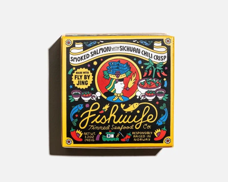
Each chocolate bar uses bold color blocks, chunky typography, and playful packaging, making it instantly recognizable on a shelf. The bars themselves are even intentionally unevenly divided to visualize inequality in the cocoa industry — a design choice that turns the product into a storytelling device.Fishwife: brilliant packaging, colors, playful fonts. The company sells ethically sourced tinned seafood, focusing on responsible fisheries and high-quality ingredients. Instead of traditional seafood packaging — which often looks generic, nautical, or old-fashioned — Fishwife built a brand that feels almost like a fashion label. The packaging features illustrated characters and playful retro-inspired graphics, bright color palettes, and a design language that feels editorial and collectible. Each tin looks almost like a little art object.