Design Trend vs. Design Truth: a short essay on what’s trending and what will actually last
Every year brings a new list of design trends. New colors dominate moodboards, layouts shift, aesthetics appear everywhere at once. For designers and brand directors, the challenge is rarely spotting the trend. It’s deciding whether it actually belongs in the brand you’re building.
Trends move quickly because the internet moves quickly. But brand identities are meant to last much longer than a feed cycle. The real skill isn’t avoiding trends entirely — it’s knowing which ones add something meaningful and which ones will look tired two years from now.
This series looks at a few trends currently circulating in design culture and asks a simple question: are they fleeting, or do they actually have staying power?
Trend 1: Burgundy Everywhere
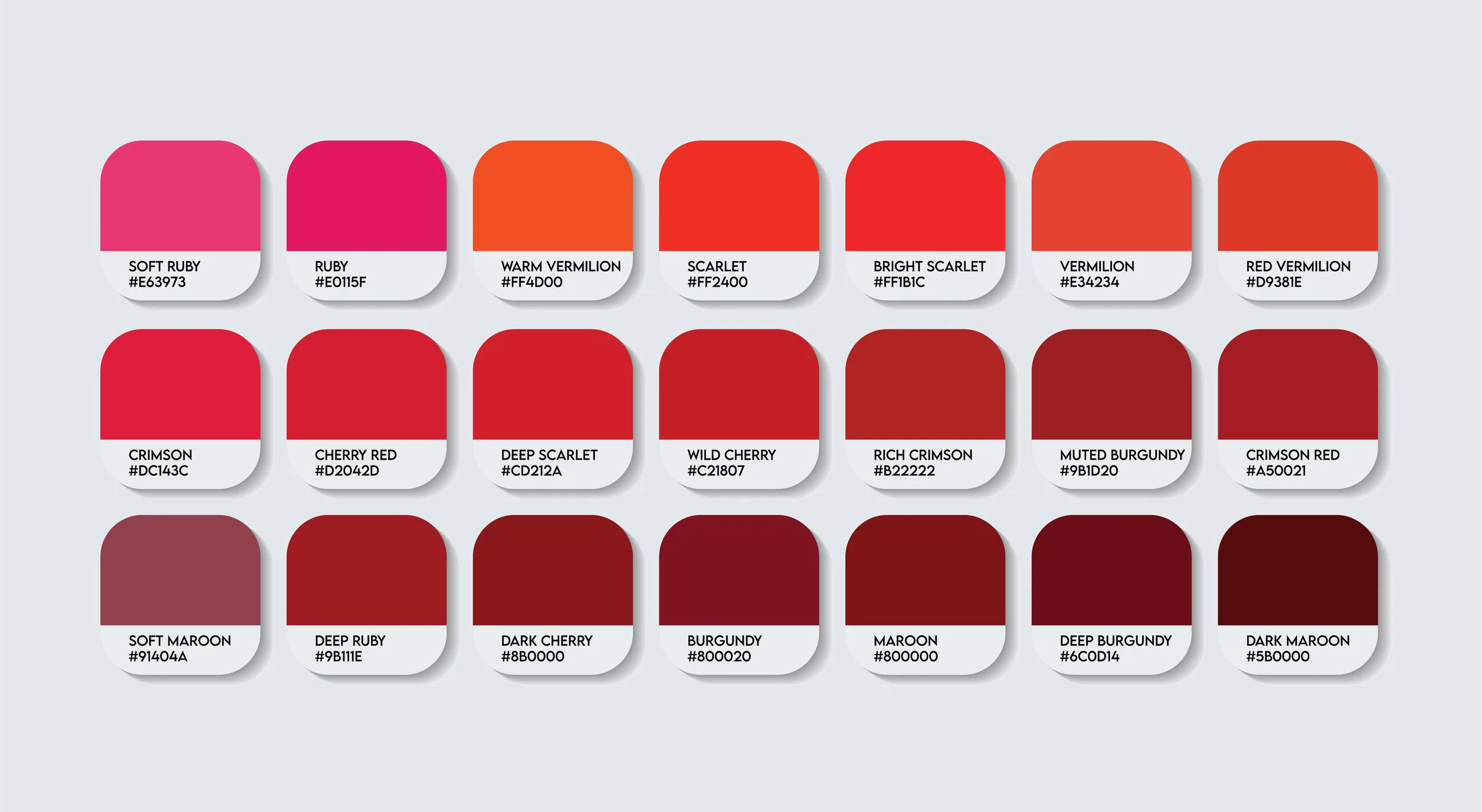
Burgundy is having a moment. Deep reds are appearing everywhere right now — in branding, packaging, interiors, fashion campaigns. It’s a beautiful color, sophisticated and warm, and when used well it can feel incredibly premium.
But color trends behave a lot like fashion. When a shade becomes extremely popular, it also becomes extremely temporary.
The real question for a brand is not whether burgundy looks good (it often does) but whether it actually represents the tone of the company. Does it communicate the atmosphere you want customers to feel? Or does it simply look appealing because it’s currently everywhere?
There are timeless uses of burgundy. Think of classic design pieces like the burgundy Wassily chair: elegant, confident, and enduring. In the right context, that depth of color works beautifully for branding as well.
But when many new companies choose the same palette, the color stops signaling individuality.

Trend 2: Print Aesthetics
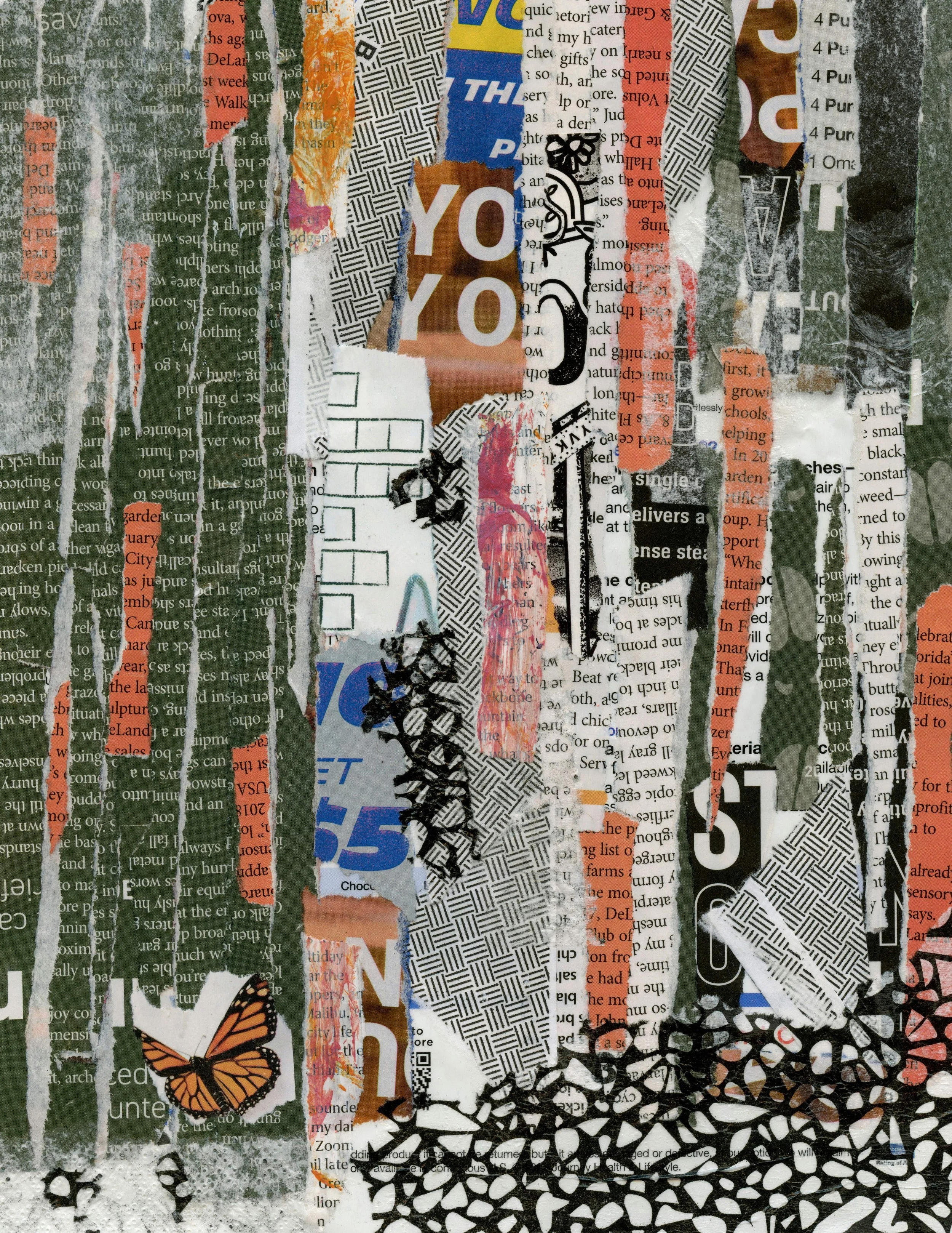
At the same time that AI image generators are becoming more powerful, designers are moving in the opposite direction visually. There’s a renewed interest in rough textures, scanned materials, collage work, and layered compositions that are tactile and imperfect.
Many of these visuals begin with analog processes: scanned paper, cut-outs, photocopies, hand-marked elements. The results often look dense and chaotic, with textures stacked on top of each other in ways that feel far more physical than digital. Artists working with collage and layered scanning techniques show how these elements can evolve into something dynamic once brought back into digital layouts.
Animation and graphic experiments built around real-world materials carry a visual complexity that software struggles to replicate convincingly. What used to be considered flaws in print production now reads as character.
This shift is not just a nostalgic design gesture. It reflects something deeper: people still respond to the physical qualities of print. The smell of paper, the texture of ink, the imperfect edge of a photocopied image — these things trigger a sensory response digital interfaces rarely achieve. There is a reason why we often add a grain effect…
Print itself was never truly gone, but it is being rediscovered as a creative tool rather than simply a distribution medium. Designers are experimenting again with what printed materials can be: posters, zines, packaging, editorial inserts, tactile brand experiences.
In that sense, it’s not just a trend. It’s here to stay.
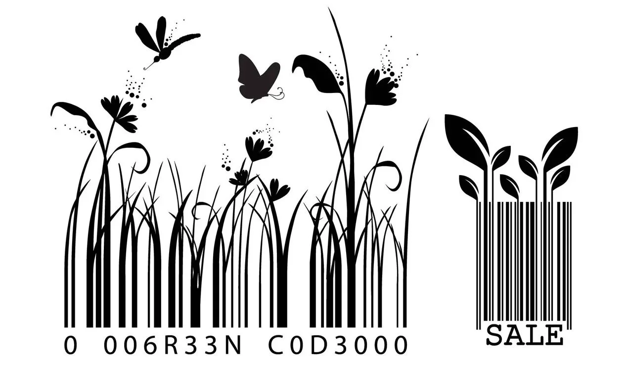
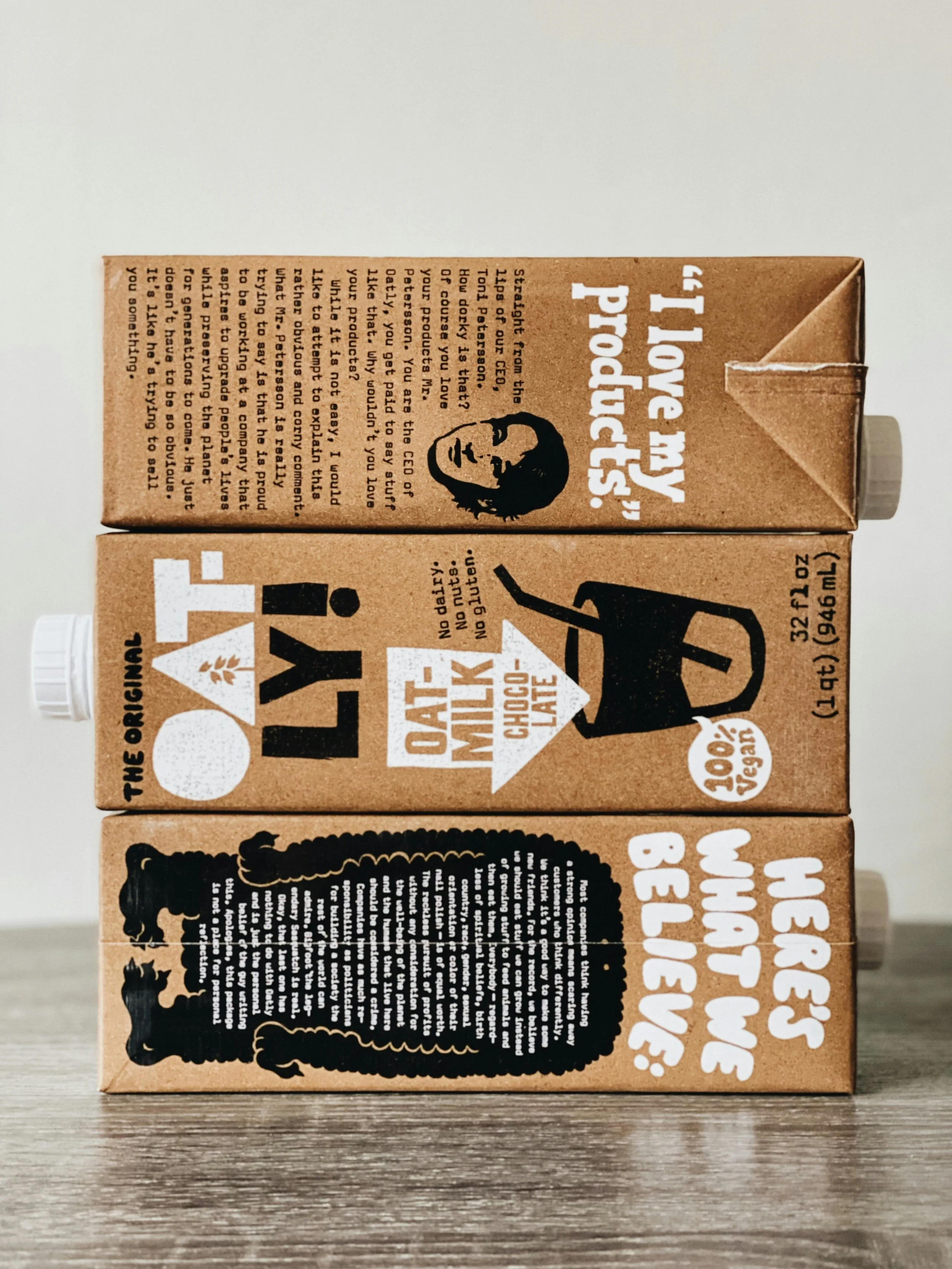
Trend 3: Micrographics
The inspiration comes from places most people rarely notice: technical labels, ingredient lists, instruction manuals, tiny regulatory text on packaging. These elements were never meant to be visually appealing. They existed purely for function.
Recently, designers have begun treating this utilitarian information as a visual texture in its own right. Small lines of text, numbers, symbols, and codes appear across layouts as part of the composition. What once sat quietly in the background becomes a deliberate design feature.
This aesthetic — sometimes described as “the beauty of technical information” — turns overlooked elements into graphic material.
When designers start looking at every small piece of communication as a design opportunity, a brand becomes much richer. Packaging labels can contain playful details. QR codes can be integrated visually instead of sitting awkwardly in the corner. Invoices, shipping notes, or instruction cards can carry small moments of personality.
Every corner of a company becomes part of the visual identity. Every surface of a brand can be designed.
Some brands already approach design this way. Even something as functional as a barcode or scan code can be customized so it subtly reflects the brand’s character. Small typographic details on packaging, hidden illustrations inside a box, or playful microcopy on a receipt all contribute to the overall experience. I immediately think of Oatly, the oat milk company known for its playful packaging.
When everything communicates the identity of a company — even the smallest elements — the brand begins to feel unmistakable. Therefore: not a trend - absolutely here to stay.